Monday, September 29, 2008

Smoking Ruin and T2108


The market broke down today and the Telechart T2108 indicator is below 10%. The T2108 indicator shows the percentage of stocks above their 40 day moving average. When it is below 20% it tends to mark buying opportunities. Take a look at the plots above. The red lines indicate when the T2108 indicator was less than 10%. These times have mostly been good times to buy for the intermediate to long term. The first plot shows data back to the crash of 1987 and the second plot shows just the last several years. Since the market began to top out in mid 2007, this is the third time that T2108 has been less than 10%. Are we nearing a bottom as in 2002 or 1987? In any case it looks like a rough ride for at least a few months.

Saturday, September 27, 2008

3x2 Method Update


The '3x2 method' I first mentioned back in October 2007 is still doing very well, considering the recent weakness of the market. Take a look at the plot above. This long only method has managed to avoid a major draw-down since peaking out in May 2008.

What About Municipals?


Municipal bond funds have taken a big hit in the last couple of weeks (see the chart above). Vanguard Long Term Tax Exempt (VWLTX) is currently yielding 4.34% and Vanguard Intermediate Term Tax Exempt (VWITX) is yielding 3.78%. Ten Year Treasuries are yielding around 3.8% on which you will have to pay federal tax. Is the risk of default on a portfolio of municipal bonds really so high?

If you want even higher yields, you can consider municipal ETFs. SEL is yielding 4.55% and is selling at a 7.5% discount to NAV. PIF is yielding 5.7% and is selling at a 12% discount to NAV. These ETFs are leveraged, have a much higher expense ratio than the Vanguard funds, and have been volatile recently so additional caution is advised.

If the credit markets stabilize in the near future, municipal bond funds could become a very attractive place for the fixed income portion of your portfolio.

Sunday, September 21, 2008

International: Best and Worst


After the market collapse of the past month and the surge back up in the last two days the best performing country fund is... Spain (picture of Andalusia above). It is often instructive to see which international equity ETFs were the best and worst over the past period. The table above shows various international ETFs and their price change over the past month. The best performing were Spain (EWP), Switzerland (EWL), Japan Small-Cap (JSC), and Japan (EWJ). The worst performing were Russia (RSX), Brazil (EWZ), Indonesia (IF), and Ireland (IRL). The S&P-500 (SPY) finished in the middle of the pack. Of the BRIC countries, China (FXI, EWH) and India (IFN) did substantially better than Russia (RSX) and Brazil (EWZ).

Asset Class Rotation -- Update


My August post 'Asset Class Rotation' described a simple rotation scheme that buys the top 3 of 5 asset classes each month. At that time the method was just coming off of a new equity peak. As you can see in the plot above, the various market panics of the last several weeks has taken a toll on the equity curve. The asset classes used were US Stocks, foreign stocks, US REITS, US Bonds, and commodities.

Should a big picture asset allocation account respond to market changes more quickly? Should a long term account have provisions to move to a more defensive posture?

Friday, September 19, 2008

A Chicken in Every Pot


All of the various bail out plans have caused a monster stock rally the last two days. Commodities also rallied, including a panic surge up in gold and silver. Will the 100s of billions of dollars expended on bail outs cause a return of concern about a weak dollar and inflation?

The government takes over all of the troubled mortgage related assets.

Bail out the car companies too?

Money market funds are guaranteed for the next year.

More companies want a ban on short selling their stock.

Monday, September 15, 2008

They Blew It Up!


The market went down hard at the open and then really fell into the close. The Lehman bankruptcy did not inspire confidence. The very negative TICK into the close and the VIX surging over 30 sets the market up for more panic at the open tomorrow.

You maniacs!
You blew it up!
God damn you, god damn you all to hell!

-- Taylor (Charlton Heston) Planet of the Apes (1968)

Sunday, September 14, 2008

Big Gap Down At the Open


The apparent Lehman Brothers (LEH) bankruptcy and the potential Merrill Lynch (MER) merger with Bank of America (BAC) has the S&P and NASDAQ futures down by about 2% this evening.

When SPY has gaped down by 1.5% or more it has been a significant buy opportunity over the last 10 years. The charts above summarize the results for the close the day of purchase and one, two, and five days after purchase.

For a 1.5% gap down, buying the open and holding to the close of same day returns an average 1.1%. This results improves to a return of 3.0% after one week. A 2% gap down shows even better results. Buying the open and holding to the close of the same day returns an average of 2.4%. This result improves to a return of 4.1% after one week. Also note that the two trade instances occurring earlier this year did exceptionally well.

Dividend Aristocrats


The performance of Low Beta/Low R-Squared type of stocks may may finally be starting to improve vs. the S&P 500 stocks. The plot above shows the performance of the Dividend Aristocrats and SPY. The Aristocrats have been noticeably outperforming SPY for the past month.

The S&P 500 Dividend Aristocrats have increased their dividend each year for at least the last 25 years. My post from December 2007 shows plots of the performance of the Aristocrats since 1998.

International?


International stock funds have experienced outstandingly bad performance over the past few months. Is it time to consider rebalancing your portfolio into international funds? (At least for long term accounts.)

The plots above show the ratio of foreign stocks (EFA) and emerging market stocks (EEM) to the S&P 500 (SPY). The ratio is the red line, the moving average the green line, and the number of standard deviations the ratio is above/below the average is the purple line. Both plots show the rapid decline of EFA and EEM in the last two months. Each ratio has made multiple moves to -2 standard deviations or less without much of an attempt to move back above zero.

Tuesday, September 9, 2008

Oh the Pain, the Pain


Very little has been working recently. The chart above shows the performance of large U.S. stocks (SPY), small U.S. stocks (IWM), REITS (ICF), large foreign stocks (EFA), emerging markets (EEM), and treasuries (TLT). Only treasuries are up over the last three months.


Alternate asset classes have done even worse over the last three months. The chart above shows the performance of commodities (DBC), currencies (DBV), gold (GLD), silver (SLV), and S&P covered call funds (BEP).

Where will it become painful enough to support another violent pop up?

Sunday, September 7, 2008

Gap Open


The big up opening of the market tomorrow may present an opportunity for a short term buy. The SPX and NDX futures are each up over 2% this evening. When the SPY has opened up by at least 1.5%, buying the open has presented an opportunity for a short term trade.

The chart above summarizes the results for the close the day of purchase and one, two, and five days after purchase. Buying the open and holding to the close of same day returns an average of 0.65% and was a winner 66% of the time. The average return from holding until the close of the next day was 0.7% and was a winner 63% of the time. The trade is not statistically significant for a hold time of two or five days. Also note that the two trades in March 2008 each did very well the day of purchase.

Monday, September 1, 2008

Rebalancing Again


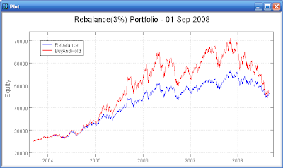
The Shannon Method of rapid rebalancing (see prior post) has some potential to capture some of the random fluctuations in stock prices. I have pursued combining a small number of relatively uncorrelated stocks in a portfolio and rebalancing them as they move 3% from the prior rebalance point.

The plot above shows the results for a portfolio starting with four stocks (GG, MSFT, O, VLO) weighted 20% each and a 20% cash position. As the stocks surge up the rebalanced portfolio lags, but the buy-and-hold portfolio dropped much faster during the recent market reversal. The rebalancing produces a smoother return. Also note that the buy-and-hold portfolio holds $5,000 cash across the entire test period while the cash in the rebalanced portfolio has increased from $5,000 to $15,000 at the end of the test period.

More work will be need to evaluate the potential of this approach. A similar approach that I came across recently is the REAP method. This method utilizes small groups of stocks (6) that are rebalanced on an every 4 months basis. The longer time period rebalancing and the utilization of multiple independent 'six-packs' is intriguing and I will investigate this concept further.