Sunday, January 27, 2008

The Market Loves Only Gold


The market has only loved gold the past few weeks. The equity market (SPY) has been making a powerful move down and even the currencies (FXA, FXC, FXE, FXY) have been having some trouble recently. This is illustrated in the image above which shows gold (GLD) and the other mentioned symbols for the past year.

If equities rally will gold back off? Gold has been moving up since early 2001. Can gold remain the last pocket of strength? The gold peak back in 1980-1981 faded well before the beginning of the 1982 equity bull market. It will be interesting to watch gold over the coming weeks.
Saturday, January 26, 2008

I Will Survive


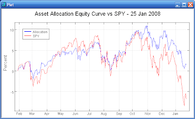
Even a simple asset allocation strategy can provide some relief during big market selloffs. For example, the plot above shows the results for SPY and a simple 60/40 allocation over the last year. The allocation consists of 15% SPY, 15% IWM, 20% EFA, 10% EEM, 30% IEF, and 10% SHY. The components represent the asset selection that is available in rudimentary retirement plans.

Are your long term accounts diversified? Have you examined a Monte Carlo simulation of your current allocation? Will you survive?

Monday, January 21, 2008

Bonanza


The 'crash' opening of the market tomorrow may be a potential bonanza. The SPX and NDX futures are each down about 5% this evening. When the SPY has opened down by at least 2%, buying the open has been a good opportunity. The chart above summarizes the results for the close the day of purchase and one, two, and five days after purchase. Buying the open and holding to the close of same day returns an average of 2.13% and was a winner 82% of the time. The average return improves a bit by holding additional time but the reliability of the trade drops from 82% to 70%.

Sunday, January 20, 2008

Random Perspective


Over the past year (250 days), the SPY has had an average daily return of -0.03% with a standard deviation of 1.05%. If you randomly select 250 samples from a normal distribution with the same parameters, the resulting equity curve will have an appearance very similar to the actual SPY curve. The first plot above shows an example of a randomly generated curve and the actual SPY curve.

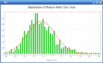
If we run the experiment many times we can get some perspective on the possible return after one year of drawing samples from this distribution. The second plot above shows a histogram of the results obtained from running the experiment 1000 times. The mean return is -6.9% with a standard deviation of 15.9%. The range of returns shows that the SPY easily could have done much better or worst than the actual one year return of about -7.5%.

In summary, the randomness content of stock data seems to be high. The surges in the randomly generated data are of the same magnitude as the recent SPY price plunge. It is probably not a good idea to read too much into many of the market's fluctuations. The range of return from a series of samples taken from the same distribution can vary widely. The market's return each year will tend to vary significantly from what your model predicts.

Tuesday, January 15, 2008

Market Melting... Melting...


The market just seems to keep melting away. There does not seem to be enough panic considering the magnitude of the decline of the last couple of weeks. The VIX has stayed in its recent range and only made a small move today.

If we do not get a surge of panic soon, the market may continue melting away (and her mangy little dog too).

Sunday, January 13, 2008

Market Stability


The market seems to have 'destabilized' back in February 2007. The plots above show a measure of the stationarity of the statistics for SPY and XLE. The plots show the stationarity for a rolling one year, two year, and three year period. When the colored lines are below the critical value (horizontal gray line), the statistics for the corresponding period are stationary.

The SPY statistics have continued to be nonstationary since February. Prior to February, the SPY had been in an eight plus month period where its statistics were stationary. In contrast, the statistics for XLE have tended to remain stationary across the entire period. The XLE was not badly destabilized in February 2007 like SPY.

The moral of the story? You must consider the stationarity of the data you are examining. If the time period you examine is not stationary, any patterns you find will likely be coincidental. The best approach is to trade something that has stationary statistics. If your usual trading method no longer seems to work it may be that the statistics of the instrument you are trading are no longer stationary.

Tuesday, January 8, 2008

Shai-Hulud


Shai-Hulud (the market) is very powerful but can be made to serve your purposes. However, you must be patient and pick your spots carefully to avoid being crushed.

Sunday, January 6, 2008

N Day Lows


Buying N day market lows is generally profitable. The plot above shows the equity curve for buying SPY at 10 day lows and selling when the SPY is back above its 10 day moving average. The average return is 0.75% with an 80% change of a win. During the down market of 2000-2002, the equity curve was flat.

While probably not suitable as a stand alone trading method, this approach does illustrate the power of a simple method to capture a significant aspect of the markets behavior. Perhaps this method could be a component of your next short term trading system.

Tuesday, January 1, 2008

2008


My results for 2007 were mediocre. 2008 will likely be volatile and choppy with many opportunities for short term trading. I will be completing the preparations for the launch of my new short term trading device this year.

<O>